Redesigning Website Fairfield Bicycle: A Case Study by Raheel Azmi
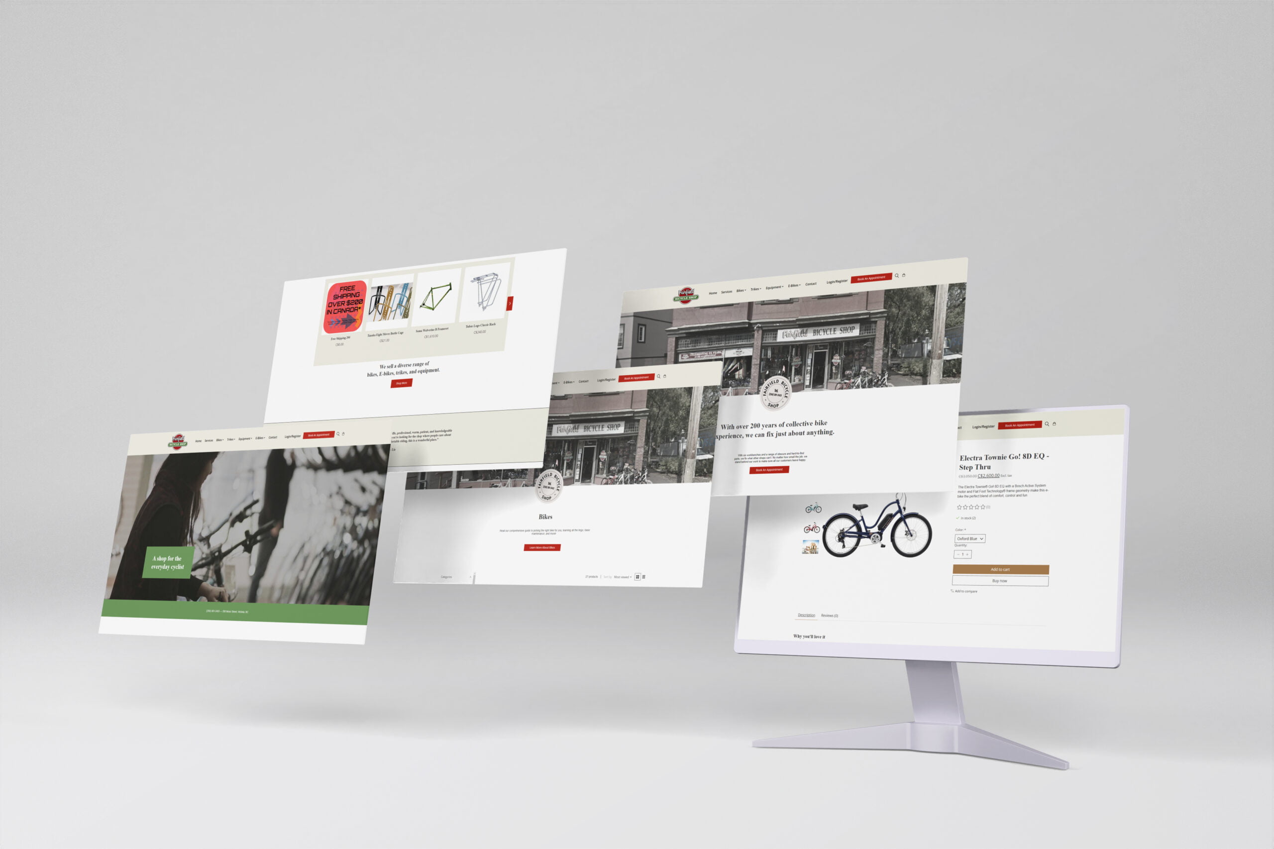
Fairfield Bicycle is a local bike shop in Fairfield, Connecticut, USA. In 2020, the company approached Raheel Azmi to redesign their website and create an online store. The goal was to create a modern and user-friendly website that could effectively showcase the company’s products and services and generate online sales.
Challenge:
Raheel Azmi faced several challenges with the existing Fairfield Bicycle website. The website was outdated and not optimized for mobile devices. Additionally, the website’s navigation was confusing, and the design did not reflect the company’s brand identity.

Solution:
LiteSpeed CMS as a Solution To address these issues, Raheel Azmi chose to use LiteSpeed CMS, a popular content management system. LiteSpeed CMS is a versatile platform that offers flexibility and ease of use.
Clean and Modern Design The new website designed by Raheel Azmi was clean, modern, and 100% responsive. The website’s focus was on UX UI, making it easy for users to navigate and find the information they needed.
Focus on UX UI To improve the user experience, Raheel Azmi simplified the website’s navigation and made it more intuitive. This helped users find the information they needed quickly, resulting in an increase in online sales for products and services.
Brand Identity Integration Raheel Azmi also incorporated the client’s brand colors and logo into the design, giving the website a consistent look and feel.
Pages and Online Store The website included pages for products, services, events, and blog posts. The product pages featured detailed information, including images, prices, and specifications. Raheel Azmi implemented an online store using LiteSpeed Web Server with LiteMage Cache.
LiteSpeed Web Server with LiteMage Cache This combination provides fast performance and high scalability for the online store. The online store allowed users to browse the company’s products, add them to their cart, and complete the checkout process with ease.
Colors & Material
Brand Yellow
#edeadf
Brand Red
#b4291e
White
#ffffff
Typography
Fira Sans
A B C D E F G H I J K L M N O P Q R S T U V W X Y Z
a b c d e f g h i j k l m n o p q r s t u v w x y z
The Outcome
Overall, the redesign of the Fairfield Bicycle website by Raheel Azmi was a success. The new website effectively showcased the company’s products and services, was easy to navigate, and improved the user experience. The website redesign helped Fairfield Bicycle achieve their goal of creating a modern and user-friendly website that effectively showcased their products and services while providing an intuitive and seamless online store for users to purchase products from.
“Raheel was excellent to work with. He worked quickly and efficiently, and was clear to communicate with. He also went out of his way to learn new things to make the job easier. Any time we encountered an issue with the project, it felt like Raheel was truly invested in fixing it. Overall, this was a very smooth website to put together!”
John ShukinShape Design
